Beware of the fountain....
sidenote: It is sideways if you didn't already notice. I fixed it in QuickTime, but it's being lame and not showing up the right way on here. Just tilt your head and its just the same!
Heres the set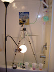
4.15.2008
The Fountain
Posted by
CAD
at
5:59:00 AM
Subscribe to:
Post Comments (Atom)

12 comments:
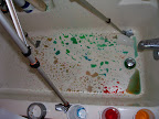
The conservation of the original composition is impressive. The color bursts seem thought out and intentionally mild, yet demanding.
i love the water coming out of the fountain! i think that was an awesome idea, and the execution was good as well. the painting is super neat and the overall look is very finished.
ps learn how to use the computer so you dont have to make art that's sideways, jerk
Sideways is kinda bothersome, but I understand the frustration that can come out of quicktime/imovie. The painting is nice and I love the color changes in the water, though the blackouts kinda gave me a headache.
i love the way it visually looks- bold designs and the overall craftsmanship. i like the idea of the water moving but i wish there was a little more movement somehow. maybe the size of the water coming out of the fountain.
Minus the part that its sideways, i think it was good! The bold lines, colors, and such were visually appealing. Good job!
Yeah, like everyone says, tilting the head sideways isn't quite cooperative with the neck muscles D: but that's okay, the composition was very well presented, and combining both 2D and 3D elements was aesthetically appealing and quite impacting on the overall execution.
Just repeating the sideways comment even though you said you tried fixing it, still distracting. I like the juxtaposition of the moving imagery with the still.
I like the way you meshed the water and the picture, although I was a little distracted by the water that appeared on the bottom(well, left side, in this case) of the screen- I didn't know whether the fountain was supposed to be spewing water onto the ground, or if it was just an editing mistake. I like that the fountain changed colors during the second half, but I wasn't so fond of the black flashes. They were distracting and really interrupted the flow of the piece. And I agree with Rachel- they kind of gave me a headache... but otherwise, I would say nice job!
this is awesome! i totally agree with marissa about the integration of 2-d and 3-d elements. i love the shadow of the fountain on the background. i don't think any more action needs to happen, but i do agree that the black flashes are a little much. i think it would be boring if you took them out but maybe they could be shorter and/or less frequent. also i wish there was more water spurting out and variation in the amount spurting (someone mentioned that) but I know there is only so much you can do with that pump.
I liked how you made everything out of paper. Cool idea to make the colors in the fountain change in the second part of the video. I think those color changes could have been portrayed much better without the black flashing screens--they were distracting and made my eyes hurt after a bit.
i agree that the craftsmanship and colors and everything are really well done. I really dislike the frequency of black flashes. maybe just less of them?
the water works very well as a subtle change for the first video, but the black flashes almost deter me in the second half. the craftsmanship is very nice, although the water thats visible in random spots of the fountain is distracting at points. Overall a good video!
Post a Comment